
A better in store banking experience
with the Lloyds Banking Group
When: 2012
Role: UX Associsate director
Team: 2 ux, 2 design and 2 interface developers
Design a self service banking kiosk to allow customers to perform account management transactions on their current and savings account in branch.
Reduce queues at the desks, allowing a greater time to be spent with customers performing more complex transactions, by offering the most requested services using the current Internet banking platform.
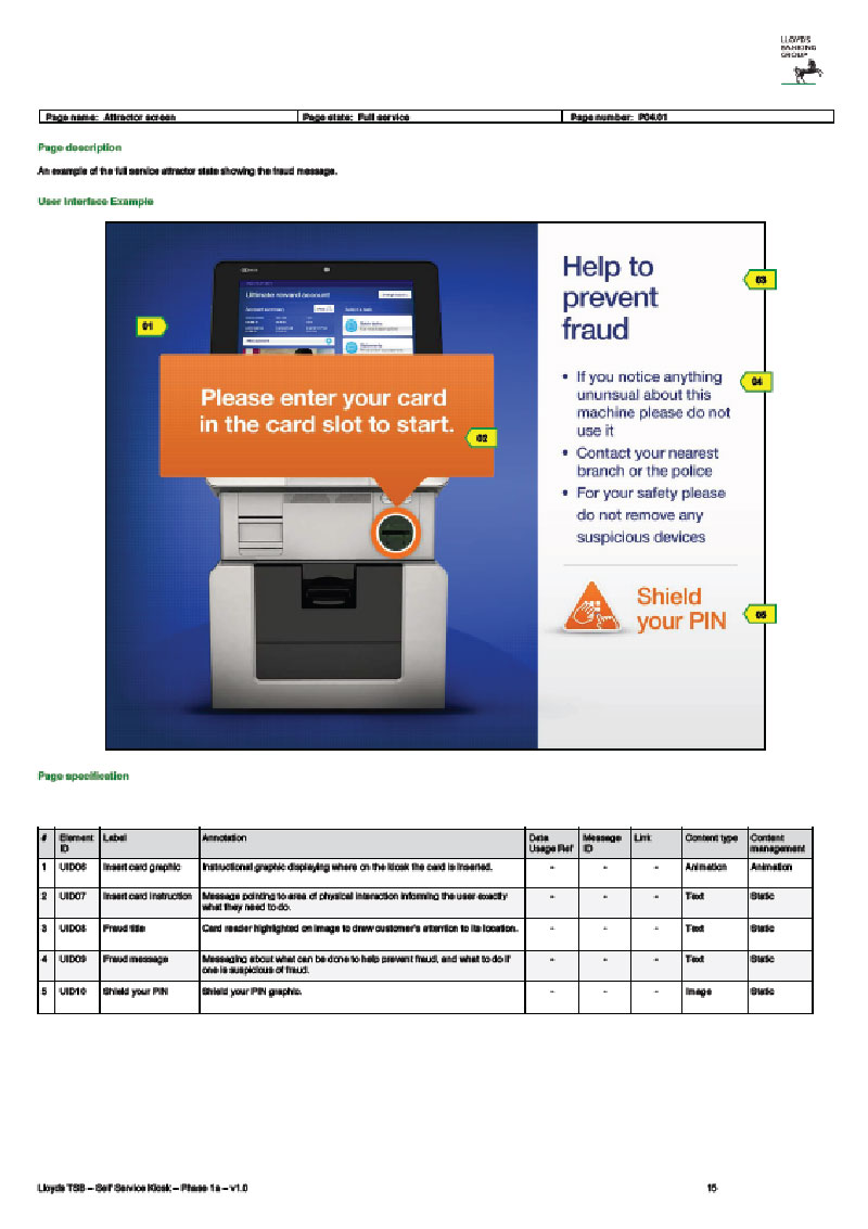
Allow customers to feel secure and confident especially as customers are accessing sensitive information in a public place.
We started off by looking at current landscape of banking kiosks and self service machines in the larger services sector and worked in partnership with the Lloyds customer research team to run some focus groups with actual custmers. We created stimulus to gage customer thoughts on the introduction of a self service kiosk, would they use one, what would they expect to be able to achieve if they used one...


We took the learning’s from the focus groups and competitor research and explored a number of different tasked based routes, taking inspiration from a simple ATM style interface to a more interactive Tablet APP
These were then refined into two initial direction initial ideas into two concepts, and retested with he focus groups


These were then refined into two initial direction initial ideas into two concepts, and retested with he focus groups


With the route and direction chosen we entered the creation stageThe work was split into 6 work packages focusing on different aspect of the Lloyds banking platform functionality. e.g. authentication, statements, payments etc.. The agreed scope of each section was listed in a working requirements document compiled by Lloyds business analysts, for each section we started off by tackling user journeys i.e As a user i want to be able to send a payment to my friend


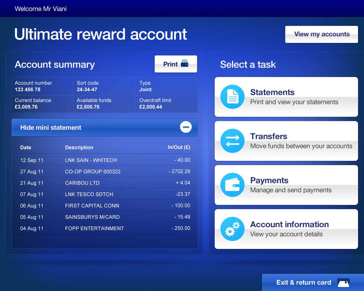


After finalising the direction for the kiosk we created a set of guiding principles to guide development of the user journeys
Accessible by default - The default design of the kiosk should be suitable for 90% of user groups
Focused simplicity – The experience should be kept focused on the task at hand
Confidently secure - Understand and be sensitive to a customers’ security concerns
Keep informed – Be explicit about processes and ensure instructions are clear to manage customer expectations
In control – Enable the customer to take charge at all times
Consistency – Reinforce conventions by ensuring consistency of design and interactions


To replicate the device during design we used a 19 inch touchscreen on a height adjustable pedestal to emulate the end device. Although a touch screen the kiosk would be limited to simple single tap and physical button entry only, and was restricted to the screens dimensions you could not scroll a page like when using an iPad app
The DAC user testing team tested a html prototype (the real front end, with a fake account) with users with impairments ranging from visual impairments, dyslexia, mobility impairments and learning disabilities.

An important factor that would ultimately determine the susses of the kiosk is its placement in the store. With so many other ATM style devices how would this one stand out & how would customers know it was something different?
The placement had to also consider privacy and security considerations, giving along the kiosk to be seen but customers the right level of privacy, and not in apposition that felt vunerable
We worked closely with the Lloyd's business analysts to adapt the experience to the capabilities of the digital banking platform or refined the interactions and flows based on learnings from user and accessibility testing.


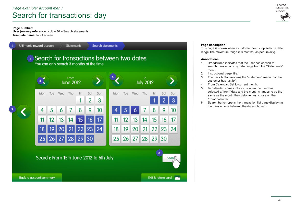
Once we were happy with an overarching user journey we would write a detailed specification for the Lloyds build team, who would take our front end html and integrate it with the digital banking platform


Thank you for your message! We may be speaking very soon.
Oops! Something went wrong while submitting the form